Ever wondered why some YouTube videos blow up while others are basically invisible? It's not always the video itself. Most of the time, it's the first impression. Your thumbnail is like the cover of a book or a movie poster for your video. It's the single biggest reason someone stops scrolling and clicks on your stuff. With billions of videos out there, your thumbnail isn't just a tiny picture; it's a mini-advertisement for your content.
Getting this right is a bit of a science. The tricks for designing a great thumbnail are a lot like the strategies for writing compelling headlines because they both have the same job: get people in the door. A great video with a bad thumbnail will almost always fail, but a good video with an amazing thumbnail can go viral. This is where you mix a little psychology, some smart design, and knowing what your audience likes. Nailing your thumbnails is one of the best skills you can learn to grow your channel.
Forget the boring, vague advice. This guide gets straight to the point, showing you the real youtube thumbnail best practices that top YouTubers use to win. We'll break down the exact tricks you need to stand out, get clicks, and grow your audience. You'll learn how to:
- Use bright, popping colors to grab attention in a flash.
- Write big, clear text that tells people what's cool about your video in seconds.
- Use close-up faces with big emotions to make people curious.
- Build a cool, consistent look so viewers know your videos instantly.
- Test your designs to see what works and keep getting better.
It doesn't matter if you're a gamer, a vlogger, or a small business—using these ten rules will completely change how people find and watch your videos. Let's dive in.
1. Use Bold, High-Contrast Colors
Your thumbnail is your video's first handshake. In the giant ocean of YouTube content, blending in is the quickest way to get ignored. Using bold, high-contrast colors is one of the best youtube thumbnail best practices because it makes people look. Think of it like a neon sign on a dark street; you can't help but notice it. The trick is to pair super bright colors with dark ones (like yellow on black, or bright blue on deep red) to create a visual "pop" that makes your thumbnail jump off the screen.

Your mission is to stop the scroll. Dull colors, like light grey on white, just vanish into YouTube's background, especially on phones where thumbnails are tiny. High-contrast colors make sure your thumbnail is easy to see and looks awesome, even with a quick glance.
Why It Works So Well
Creators like MrBeast are the kings of this. He often uses bright yellows, reds, and greens that are impossible to miss. It's not just about being loud; it's about psychology. Colors that clash in a good way create excitement and tell our brains, "Hey, this is important and full of energy!" The Sidemen often use a high-contrast blue and white theme, which looks clean but is still super easy to spot.
Key Insight: Your thumbnail is in a beauty contest with dozens of others on the homepage. Using high-contrast colors isn't just a style choice; it's how you win the first click.
How to Implement This Strategy
Using bold colors is easy, but making them look good takes a little thought. Here's how to do it:
- Stick to a Few Colors: Don't go crazy and use the whole rainbow. Pick two or three main colors that really pop against each other. This keeps your design looking cool, not chaotic.
- Check Against YouTube's Background: People use YouTube in light mode and dark mode. Look at your thumbnail on both a white and a black background to make sure it stands out no matter what.
- Match Your Brand: You want to be eye-catching, but the colors should still feel like you. If your channel is calm and relaxing, you can use a mostly simple design with just one pop of a bold color.
- Use a Color Wheel: If you're stuck, google "color wheel tool." Look for "complementary colors"—they're opposites on the wheel and are guaranteed to have high contrast.
2. Large, Legible Text with Minimal Words
Text on your thumbnail can be the hook that grabs a viewer, but it's worthless if no one can read it. One of the most important youtube thumbnail best practices is to use huge, bold text and keep the words to a minimum. Remember, your thumbnail will be seen on tiny phone screens. Small or fancy text just turns into a blurry blob. Your goal is for someone to understand the idea in less than a second.

Think of your thumbnail text like a billboard on a highway. You have one second to get your message across. Using just a few powerful words like "IT WORKED," "BIG MISTAKE," or a product name makes people instantly curious without being confusing. Keeping it simple makes your video's main idea super easy to get.
Why It Works So Well
Creators like Ali Abdaal and Linus Tech Tips are pros at this. Ali Abdaal uses short, punchy phrases that promise you'll learn something cool. Linus Tech Tips often just uses the product name, so you know exactly what the video is about. This works because it's easy. Viewers don't have to strain their eyes or think too hard; the thumbnail text tells them what they need to know right away, making it easier to decide to click.
Key Insight: Your thumbnail text isn't a summary; it's a headline. Its only job is to make someone curious enough to click. Keep it short, strong, and so big you can't miss it, even on a tiny phone.
How to Implement This Strategy
Making your text work is more than just making it bigger. Here are the steps:
- Choose Bold, Simple Fonts: Use thick, clean fonts like Impact, Bebas Neue, or Arial Black. These are easy to read from a distance and don't have tiny details that get lost when the image shrinks. You can find cool ideas by checking out different pop culture fonts.
- Use 1-3 Words Max: Force yourself to be short and sweet. What's the biggest, most exciting idea in your video? Use that. "My Biggest Regret" is way better than "In This Video I Talk About My Biggest Regret."
- Add an Outline or Shadow: Put a thick, contrasting outline (like black around white text) or a solid color box behind your words. This makes the text pop off any background image so it's always easy to read.
- Do the "Postage Stamp" Test: Before you upload, shrink your thumbnail down on your computer screen until it's super small. If you can still easily read the text, you've nailed it.
3. Feature Close-Up Human Faces with Strong Emotions
We're all wired to look at other people's faces. That's why putting a clear, close-up face with a big, exaggerated emotion in your thumbnail is one of the most powerful youtube thumbnail best practices. It instantly creates a human connection and makes people curious. When we see a face that looks shocked, super happy, or confused, our brains want to know why, which makes us way more likely to click.

The goal is to show the main feeling of your video in a single look. A thumbnail with a shocked face tells you something surprising is about to happen. A happy face promises something fun. It's a super-fast way to communicate that works on everyone, no matter what language they speak.
Why It Works So Well
Top creators like MrBeast have built their entire channels on this strategy. He almost always uses wide-eyed, open-mouthed expressions of shock to show that his challenges are insane. Other YouTubers use exaggerated reactions to create drama and pull viewers into their stories. This trick turns a boring picture into an emotional hook that promises a good story.
Key Insight: A face is like a magnet for our eyes. Add a strong emotion, and you're telling a story before anyone even reads the title. This is a huge booster for your click-through rate.
How to Implement This Strategy
Using faces and emotions isn't as simple as taking a quick selfie. Here's how to do it right:
- Exaggerate Your Expression: Don't be shy. Whether you're showing joy, shock, or confusion, turn it up to 11. Make the emotion big and obvious.
- Keep it High-Quality: The face needs to be well-lit and in sharp focus. A blurry or dark photo looks unprofessional and can make people not trust your content. Just like you want to learn more about creating a quality video intro, your thumbnail deserves that same level of care.
- Match the Feeling to the Video: Make sure the emotion in the thumbnail actually fits what's in the video. A shocked face on a boring tutorial is just clickbait, and your viewers will hate it.
- Position it for Impact: Put the face on one side of the thumbnail. This leaves room for your text or other cool graphics without covering up that all-important emotional expression.
4. Maintain Consistent Visual Branding
When someone is scrolling through YouTube, you want them to recognize your videos instantly, without even reading the title. That's where consistent branding comes in. Using the same style for all your thumbnails is a huge youtube thumbnail best practices because it builds recognition and trust. It's like a signal to your fans that says, "Hey, this is another one of my awesome videos!" This means using the same colors, fonts, and general layout over and over.
Think about your favorite soda brand—you can spot that can from a mile away because of its colors and logo. Your thumbnails should have that same effect. It's how you turn casual viewers into loyal fans who actively look for your new stuff.
Why It Works So Well
Creators like MKBHD (Marques Brownlee) have mastered this. He uses a signature red-and-black theme that makes his tech reviews instantly pop. Vsauce often uses a specific blue-and-yellow color combo and the same font, creating a unique look for his brainy content. This consistency tells viewers you're a pro and that they can rely on you to deliver good content every time.
Key Insight: Consistency doesn't mean every thumbnail looks exactly the same. It means creating a visual theme that ties all your videos together, making your channel feel like a professional, unified collection.
How to Implement This Strategy
Creating a consistent brand is easier than you think. Here's how to get started:
- Create Thumbnail Templates: Use a tool like Canva or Photoshop to build a few basic templates. This will save you a ton of time and make sure every thumbnail has the same core structure, fonts, and colors.
- Make a Style Guide: Decide on your brand's look. Pick two or three main colors, one or two fonts, and a layout you like (e.g., your face on the right, text on the left). Stick to these rules for every thumbnail.
- Put Things in the Same Spot: If you always put your face or a logo in your thumbnail, try to place it in the same corner every time. Our brains are great at recognizing patterns, and this will help people remember your style much faster. A cool logo can be a big part of this; if you want ideas, you can learn how to animate a logo on priyansh.net.
5. Avoid Overly Cluttered or Complex Designs
Sometimes, you might feel like you need to throw everything on your thumbnail to get attention: tons of pictures, flashy text, logos, and bright graphics. But hold on! One of the most important youtube thumbnail best practices is to keep it simple. A cluttered, messy design is confusing and makes it impossible for someone to figure out what your video is about in the one second you have to impress them. A clean, focused thumbnail looks professional and clear.
The goal is to be understood instantly. When a viewer scans their homepage, your thumbnail has less than two seconds to do its job. If they have to work to understand your thumbnail, they'll just keep scrolling. Simplicity makes sure your thumbnail looks good at any size, from a big TV screen to a tiny phone.
Why It Works So Well
Channels like Apple and TED-Ed are amazing at this. Apple's thumbnails for its products often just show the product on a clean, simple background. This makes it feel premium and focused. TED-Ed uses beautiful, simple animations that make you curious without being overwhelming. This minimalist style tells the viewer's eye exactly where to look, whether it's a person's face, a cool object, or a short, powerful title.
Key Insight: A simple thumbnail isn't a boring one. It's a smart design that cuts out all the junk to make the main message stronger and easier for a scrolling viewer to understand.
How to Implement This Strategy
Adopting a "less is more" mindset takes a bit of discipline. Here are some simple steps to clean up your designs:
- Limit Your Elements: Stick to 3-4 main things, tops. This could be a face, a key object, and a few words of text. Anything more will just look like a mess.
- Use the 'Squint Test': When you're done with your design, squint your eyes and look at it from far away. Can you still tell what it's about? If it just looks like a blurry blob, it's too complicated.
- Have One Clear Focus: Decide what the single most important thing is that you want people to see. Make that the "hero" of the thumbnail. Everything else should just support it, not fight for attention.
- Embrace Empty Space: You don't need to fill every single pixel. Having empty space (or "negative space") around your main subject helps it stand out and gives the whole design a clean, professional feel.
6. Optimize for Mobile Viewing and Small Sizes
A thumbnail that looks amazing on your big computer screen can turn into an unreadable mess on a smartphone, which is where most people watch YouTube. Making your thumbnail look good on mobile is one of the most important youtube thumbnail best practices because if it doesn't work small, it doesn't work at all. This means you should design for the smallest screen first, making sure your main image and text are big and bold enough to be understood on a phone.
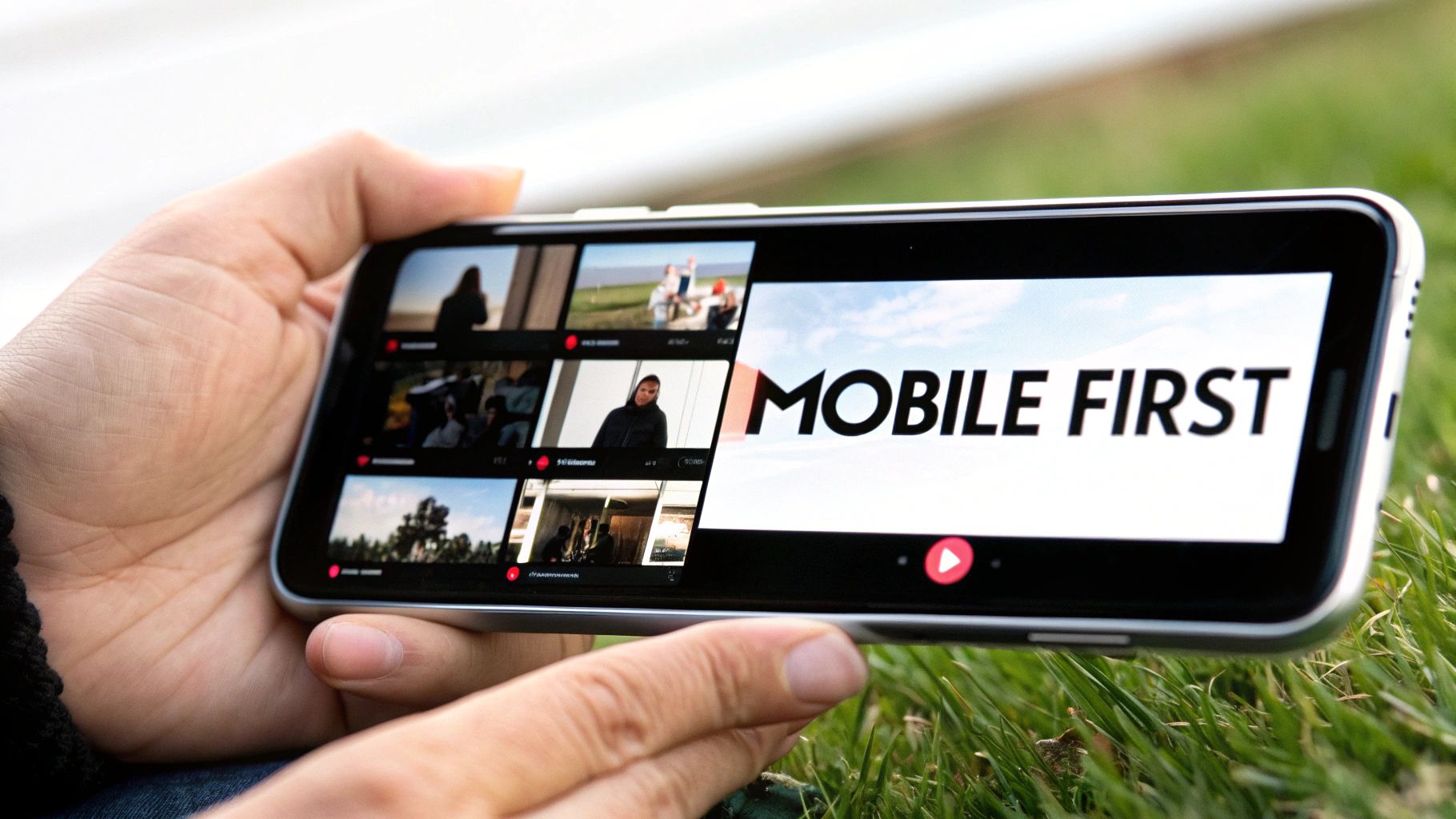
Think about it: your thumbnail is often seen in a tiny little box on the homepage or in the recommended videos list. Fancy details, thin fonts, and soft colors completely disappear when they're that small. Designing for mobile first forces you to focus on what really matters, which makes your thumbnail better on every screen.
Why It Works So Well
People scroll through YouTube super fast, especially on their phones. They make decisions in a split second based on what catches their eye. Creators who design for mobile get more clicks because their thumbnails are easy to understand instantly. Their designs are built to pass the "squint test": if you can squint your eyes and still get the main idea, it's a good design. That clarity is what stops the scroll.
Key Insight: Your thumbnail isn't a poster for your wall; it's a tiny billboard for a phone. If it doesn't grab attention on a small screen, you've already lost most of your potential viewers.
How to Implement This Strategy
Designing for small screens means changing how you think about design. Instead of making a big design and shrinking it down, build it to look good when it's small from the start.
- Always Preview it Small: Before you finish, zoom out in your design program to 25% or even smaller. This is what it will look like on the YouTube homepage. If something becomes hard to see, make it bigger or simpler.
- Use the Right Size: Start with a 1280×720 pixel canvas (that's a 16:9 ratio). This makes sure your image is high-quality on big screens like TVs, but forces you to use big, bold elements that will still look good when they're tiny.
- Avoid Tiny Details and Thin Fonts: Skinny, elegant fonts might look nice up close, but they become unreadable on a phone. Stick to thick, bold, simple fonts. The same goes for small background details—they just become noise, so get rid of them.
- Test on Your Actual Phone: The best way to know if it works is to see it where it'll be viewed. Before you upload, send the picture to your phone and look at it in your photo gallery. How does it look next to other pictures? Is it eye-catching?
7. Create Psychological Curiosity Through Pattern Interrupts
One of the coolest youtube thumbnail best practices is to make people stop and think, "Wait, what's going on here?" You do this with something called a "pattern interrupt"—a trick that breaks someone's mindless scrolling by showing them something they don't expect. The goal is to create a "curiosity gap" by showing a visual puzzle, a weird mix of objects, or something that just seems impossible. This makes them want to click to get the answer.
Your thumbnail should be like a visual question that you can only answer by watching the video. When people see something that doesn't quite add up, their brains are wired to want an explanation. This makes them much more likely to click than if they see a normal, boring picture.
Why It Works So Well
Creators like Veritasium and Tom Scott are brilliant at this. Veritasium might show something that seems to break the laws of physics, making you question everything. Numberphile visualizes complicated math problems in weird, interesting ways that don't look like math at all. The key is to break people's expectations of what a thumbnail for your topic should look like. This makes your video seem unique and super interesting.
Key Insight: A confused mind wants answers. By creating a visual mystery, your thumbnail uses a person's natural curiosity to get them to click. The click is the only way for them to solve the puzzle you've created.
How to Implement This Strategy
Creating a pattern interrupt is more about creative thinking than technical skill. Here's how you can do it:
- Ask a Visual Question: Make your thumbnail pose a question. For example, show an impossible-looking trick shot like Dude Perfect does, or a strange science experiment that makes people wonder, "How did they do that?"
- Use Unexpected Combos: Put two things together that don't belong. Think of a computer mouse next to a slice of pizza, or someone swimming in a pool of something that definitely isn't water.
- Break Your Own Rules: If you have a consistent thumbnail style, break it once in a while with something totally different. This will catch your subscribers' eyes and tell them that this video is extra special.
- Promise an Answer: Make sure the mystery in your thumbnail is actually explained in your video. The goal is to make people curious, not to trick them with clickbait. This is super important for building trust. For ideas, think about how you can make your video intros just as catchy. Learn more about crafting compelling introductions on Priyansh.net.
8. Use High-Quality, Professional Imagery and Production
Your thumbnail is your video's shop window. A blurry, low-quality picture is like a dusty, dirty window that no one wants to look through. Using high-quality, professional-looking images is a basic youtube thumbnail best practice because it immediately tells people your content is good. A sharp, well-lit, and clean image signals that the video will also be high-quality, which builds trust before they even click play.
On the flip side, a pixelated or poorly lit thumbnail makes your video look amateur, even if the content is amazing. The goal is to show a picture that looks polished and intentional, letting viewers know that your video is worth their time.
Why It Works So Well
Creators like MKBHD and Unbox Therapy have built their channels on looking professional, and that starts with their thumbnails. Their images have perfect lighting, sharp focus, and look like they could be in a fancy magazine. This isn't just about looking pretty; it's about showing you're an expert. Professional images tell the audience that you take your content seriously, which makes them much more likely to click.
Key Insight: A high-quality thumbnail is like a promise to the viewer. It promises that the video itself will be well-made and worth watching. A low-quality image breaks that promise and is a fast way to lose a viewer.
How to Implement This Strategy
You don't need a Hollywood budget to look professional. Here are some simple ways to make your thumbnails look better:
- Get Good Lighting: Natural light from a window is your best friend (and it's free!). If you're inside, a simple ring light can make a huge difference in how clean and professional your shots look.
- Use High-Resolution Pictures: Always start with the highest quality image you can get. YouTube's recommended size is 1280×720 pixels, so if your original picture is even bigger, it will stay sharp.
- Learn Basic Editing: You can use tools like Photoshop, Canva Pro, or even free apps to adjust brightness, contrast, and sharpness. Making your thumbnails and videos have a similar color style also makes your brand look more professional. For next-level images, you can even explore how to generate images with AI.
- Keep it Consistent: Professionalism comes from being consistent. If you edit your thumbnails in the same style every time, your channel page will look like a polished, curated collection. Your video quality should match too; learn about improving your production skills to make everything look amazing.
9. Incorporate Relevant Visual Context and Specificity
A great thumbnail doesn't just get attention; it tells you exactly what to expect. One of the best youtube thumbnail best practices is to show, not just tell, what your video is about with specific pictures. Instead of a generic design, including the actual subject of your video helps viewers instantly know what it's about and feel confident that they've found the right video. This builds trust and gets you more clicks from people who are actually interested.
Think of your thumbnail like the cover of a book. If the cover has a dragon on it, you expect a fantasy story, not a cookbook. A specific thumbnail promises specific content, which makes it super easy for a viewer to decide to click.
Why It Works So Well
The best creators in any niche know that being specific is powerful. Linus Tech Tips always shows the exact gadget he's reviewing, so there's no confusion. A cooking channel like Binging with Babish shows off the delicious finished dish, giving you the satisfying payoff before you even start the video. This works because it answers the viewer's silent question: "Is this video for me?" By showing the product, the place, or the key moment, you confirm that your video is exactly what they're looking for.
Key Insight: People are searching for answers or entertainment about a specific topic. A thumbnail that visually confirms you're delivering on that topic has a huge advantage over one that is vague or clickbaity.
How to Implement This Strategy
Adding specific context to your thumbnails is easy and super effective. Here's how to do it:
- Show the "Thing": Whatever your video is about, make it the star of the thumbnail. Reviewing a phone? Show the phone. Traveling to Paris? Show the Eiffel Tower. Make the main subject impossible to miss.
- Capture a Key Moment: Go through your video and find one single frame that perfectly sums up the main idea or the most exciting part. A gamer could show a shot from an epic boss fight; a DIY channel could show the cool finished project.
- Add a Few Words for Clarity: If the picture isn't totally clear on its own, add a few words to explain. A picture of a laptop could be a review, a repair guide, or something else. Adding "RTX 4090 Review" makes it crystal clear.
- Make it Look Good: Just because you're showing the real subject doesn't mean it has to be a boring screenshot. Use good lighting, a clean layout, and bright colors to make your specific image look awesome.
10. Test, Analyze, and Iterate Based on Performance Data
Making a great thumbnail isn't a one-time thing; it's an ongoing experiment. The most successful creators are always testing different designs, looking at the data in their YouTube Analytics, and tweaking their strategy. This is one of the most powerful youtube thumbnail best practices because you stop guessing and start using real data to figure out what makes your audience click.
The idea is simple: you post a video, check its click-through rate (CTR), see how it compares to your other videos, and try to figure out what made it do well (or not so well). By making changes based on real results, you slowly get better and better at grabbing attention.
Why It Works So Well
MrBeast is famous for this data-driven approach. He's known for making several different thumbnails for one video and testing them to see which one performs best before the video even goes public. This works because every audience is different. What a gaming audience loves might not work for a cooking channel. By looking at your own data, you learn the specific visual language that your viewers respond to, which leads to a higher CTR and more views from YouTube's recommendation algorithm.
Key Insight: Your YouTube Analytics is your audience talking directly to you. Ignoring your thumbnail's CTR is like throwing away free advice on how to grow your channel.
How to Implement This Strategy
Turning your thumbnail design into a science experiment is easier than it sounds. Here's how to get started:
- Find Your Average: Go into your YouTube Analytics and find your channel's average click-through rate. That's your score to beat. The goal for every new thumbnail is to get a higher score than your average.
- Use YouTube's A/B Testing Tool: YouTube now has a feature called "Test & Compare" that lets you upload up to three different thumbnails. YouTube will show them to different people and tell you which one was the "winner" based on which one got the most watch time.
- Change One Thing at a Time: When you're testing, only change one big thing. For example, use the same picture but try different text. Then, use the winning text but try a different background color. This helps you figure out exactly what made the difference.
- Look for Patterns: Don't just look at one video. Track the CTR of your last 10-20 videos. You might start to see patterns, like thumbnails with your face in them do better, or a certain color always gets more clicks.
Top 10 YouTube Thumbnail Best-Practices Comparison
| Thumbnail Strategy | Implementation complexity | Resource requirements | Expected outcomes | Ideal use cases | Key advantages |
|---|---|---|---|---|---|
| Use Bold, High-Contrast Colors | Low–Medium — choose/test color combos | Low — design tools, color tests | Increased visibility and CTR | Crowded feeds, attention-grabbing thumbnails | Immediate visual impact; stands out at small sizes |
| Large, Legible Text with Minimal Words | Low — simple typography rules | Low — readable fonts and layout | Faster message comprehension; higher CTR | Tutorials, how-tos, benefit-driven videos | Instant clarity; reduces cognitive load |
| Feature Close-Up Human Faces with Strong Emotions | Medium — requires direction and lighting | Moderate — camera, talent, lighting | Significant CTR and emotional engagement | Vlogs, reactions, challenges, personality channels | Strong emotional connection and memorability |
| Maintain Consistent Visual Branding | Medium — create templates and style guide | Moderate — design time, templates | Improved brand recognition and loyalty | Channels building identity and repeat viewers | Consistency builds trust and repeat views |
| Avoid Overly Cluttered or Complex Designs | Low — apply minimal design principles | Low — disciplined layout and assets | Clearer messaging; better legibility on all devices | Professional, informational, minimalist channels | Faster comprehension; cleaner professional look |
| Optimize for Mobile Viewing and Small Sizes | Medium — requires testing at actual sizes | Low–Moderate — device previews, specs | Better mobile CTR and consistent message delivery | Mobile-first audiences and broad-reach channels | Ensures thumbnails work at real viewing sizes |
| Create Psychological Curiosity Through Pattern Interrupts | Medium–High — conceptual and creative work | Moderate — design experimentation and testing | Higher CTR and memorability when authentic | Educational, mystery, storytelling content | Grabs attention via novelty and curiosity gaps |
| Use High-Quality, Professional Imagery and Production | High — production and post-pro skills needed | High — cameras, lighting, design software | Higher perceived quality, trust, and CTR | Tech reviews, premium content, branded channels | Projects authority and sustained brand value |
| Incorporate Relevant Visual Context and Specificity | Medium — capture or select accurate frames | Moderate — footage/screenshots, editing | Better relevance-based CTR and retention | Reviews, tutorials, demonstrations, news | Sets accurate expectations; reduces bounce |
| Test, Analyze, and Iterate Based on Performance Data | High — requires analytics and experimentation | Moderate–High — time, tools (YouTube Studio, A/B) | Data-driven CTR and retention improvements over time | Growth-focused channels and established creators | Validates what works; enables continuous optimization |
Your Next Click-Worthy Masterpiece Awaits
You've made it! This is your complete guide to making YouTube thumbnails that practically scream "click me!" But don't think of this as just a checklist. Think of it as getting a new superpower. Each of these best practices is a tool you can use to turn someone scrolling on their phone into your next subscriber. We've gone beyond the boring advice and looked at the real, actionable tricks that the biggest YouTubers use.
Let's do a quick recap. You now know that your thumbnail is a mini-story, a tiny billboard, and a psychological trigger all in one. You know how to use bold, high-contrast colors to pop off the screen and large, clear text to make an instant promise. You know how to connect with people using expressive faces and build a loyal fanbase with consistent branding.
But being a thumbnail master is also about what you don't do. By learning to avoid clutter, you make your message clear. By optimizing for mobile, you're respecting the fact that most people are watching on their phones. These aren't just random tips; they're the basic rules of modern visual communication.
From Good Practice to Great Performance
The real secret to winning, however, is changing your mindset. Stop thinking "post it and forget it" and start thinking about constant improvement. That's what separates the pros from the amateurs. This is where the advanced tricks come in:
- Psychological Curiosity: You're no longer just showing what's in the video; you're creating a little mystery that people feel like they have to solve by clicking.
- Quality as a Standard: You now know that high-quality, professional images aren't just a nice-to-have. They're a must, because they signal that your content is worth watching.
- Data-Driven Decisions: The most important takeaway is the power of testing. Your Click-Through Rate (CTR) isn't just a number; it's your audience telling you what they like. Listening to that data and making changes is the fastest way to grow your channel.
Using these youtube thumbnail best practices is the first, most important step in getting someone to watch your video. Your thumbnail is the handshake, the movie poster, the book cover. It makes a promise. Your content, from the very first second, has to deliver on that promise. A killer thumbnail followed by a weak intro will make people click away instantly, which hurts your watch time and tells YouTube your video isn't as good as it looked.
Think of it this way: your thumbnail earns the click, but your intro earns the watch. A polished, professional, and on-brand video intro confirms to the viewer that they made the right choice, reassures them they're in the right place, and shows them you're a pro from the start. This smooth transition from thumbnail to video is key to keeping the audience you worked so hard to get. Now, go open your favorite design tool and get ready to create the thumbnail that will make your next video a hit. Your masterpiece is waiting.
A stunning thumbnail deserves an equally impressive introduction to keep viewers hooked. Let Priyansh Animations craft a custom, studio-quality animated intro that perfectly matches your brand and elevates your content, ensuring the viewer experience lives up to the promise of your click-worthy thumbnail. Visit Priyansh Animations to see how professional branding can transform your videos from the very first second.
